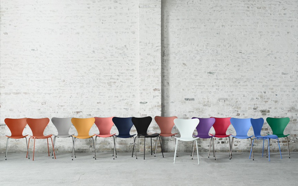
The Nine New Colours
Tal R has created a new range of colours for the iconic Series 7 chair, all complementing each other beautifully.
‘I grew up with the Series 7 chair. It’s the simplest chair I know. It doesn’t want to be anything more than just a chair. And I love the shape, which is scintillating and has a woman’s sensual curves. So it was a great pleasure for me to choose the new colours for the chair. All the colours have one thing in common: They lay in between two colours and are constantly pulled in both directions; this gives the colours depth and the ability to conjure up mental images. To me, it’s important that every single colour has a story behind it that sparks associations. Therefore, each of the nine colours that I’ve chosen for the Series 7™ chair has its own story and lets you see the chair in a new perspective,’ says Tal R.
Tal R has chosen Opium Red, which sparks associations to Shanghai of the 1930s. With its decadent expression, Opium Red symbolizes the mystique of the Far East.
Another new colour is Ai, which is Japanese for indigo blue, a deep shade of blue that is forever drawn towards black. At first glance, the colour appears a dark, rich blue, but after some time darkens further and takes on an amazing sense of depth.
Chocolate Milk Brown is an indulgent brown with a touch of creamy white. This colour is drawn between brown and rose. It sits right in between the two shades but with a touch more rose, which gives a wonderful warm feel. The colour is like a warm embrace with an appeal that enchants the eye.
Named after the port city in north-eastern Italy, Trieste is the impossible blue that has been used by so many artists over the decades, especially the impressionists. Tal R chose the name Trieste because of the many stories he has heard about the place as a windswept port surrounded by a sparkling blue sea. That is the image behind the colour. Tal R does not want to visit Trieste, because he suspects that his mental image might be stronger than the real-life experience. Trieste lies somewhere between violet and blue, strong forces pulling it in both directions.
Hüzün Green is inspired by Islamic green, which is also used on the public buses in Istanbul. Hüzün is Turkish for wistful, a word that captures the dreamy mood of the colour with its bittersweet touch of nostalgia and yearning. The unique quality of this green is its faded character. It used to be something else, and the implied patination imbues it with a story all its own.
Egyptian Yellow is a rich and saturated colour that sparks associations to ancient Egypt. The colour has a touch of lead which gives it a highly characteristic and distinctive tone.
Altstadt Rose is one of Tal R’s signature colours, as he always includes a rose in everything he creates. The rose expresses impermanence and fiery beauty. This rose has its golden days behind it and is now a fading beauty. To Tal R, this colour suggests a cherished object that has been hidden away in a drawer for a long time, fading with time and acquiring a new expression and a different beauty than it once had.
Evren Purple is named after Tal R’s wife. When he looks at her, he sees the colour purple. To him, she is the essence of that colour, embracing it in every way – attractive and passionate, like the colour itself.
Chevalier is an oriental orange. With its air of aristocracy and fine riding horses, Tal R describes it as the most exclusive colour on the new scale.